You’ve probably run across dozens, if not hundreds, of fake web sites on the Internet without even knowing it. With a few of them, you can tell right away that something is fishy about it and some web browsers are getting better at warning you when a site is questionable. Since a huge portion of these sites are aimed at women, I thought this would be the perfect place to show you how to identify the tricks of an Internet scammer.
What qualifies me to grab a scapel and dismember these filthy tricksters? I’m a web designer. That’s my “day” job outside of building the Girls Can’t WHAT? site. I know code. I know design. And I know the web and how it works. I’m also a skeptic – especially when something sounds too good to be true. I know how these sites are built and I think web surfers everywhere should know how to be aware of a scam on the Internet. So here we go…
A prime example of a scam
A couple weeks ago, a link to the following web page was posted on my Girls Can’t WHAT? fan page. I won’t link directly to the page (I don’t want to give it any attention from Google since it’s clearly a scam) so I’ll post a screenshot. You can click on it to see the full web page. Go ahead and zoom in to look it over before we tear it to pieces.
Looks kind of legit, right? Nice news logo, clean design, mentions Google headquarters with a photo. Not too bad. Except for the fact that the headline sounds too good to be true, the rest of the page is pretty ordinary.
So here’s the first test…
Real photos that are actually fake

Pick any photo on the page and copy or drag it to your desktop for a moment. Now head over to TinEye.com. TinEye is a reverse image lookup service. Upload the image you just copied to see where else that photo shows up on the Internet. If it’s a scam site, chances are that image has been used multiple times.
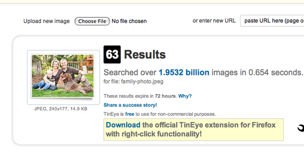
For our example, I grabbed the image of the nice looking family in the sidebar and ran a search. Sure enough, it has been used 63 times on quite a few sites (and by the time this post is published, this page will be #64). Some sites were good and some were bad. So it’s probably safe to say this is a stock image – meaning an image that anyone can purchase and use for advertising or in other media.
Here are the TinEye results for that photo (click it to see full screen):
Next up…
The relative date trick
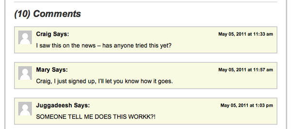
As a code geek, I’m aware of a lot of ways to manipulate the date function. One such way is to make a static web page always look like it’s fresh and the content is recent. The first time I visited the site, the comment section looked like this:

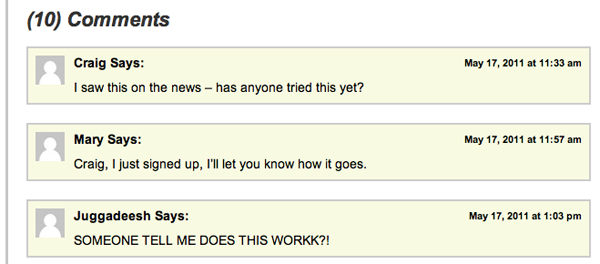
And here’s what it looked like today (May 19th) when I returned:

See the difference? The only thing that changed was the date. This is because the code is picking up the today’s date from server and then subtracting 2 days from it to make the page look new. This not something you can catch just by visiting once, but if all of the dates are the showing same day you might want to think twice or use one of these other scam spotting techniques in this article to determine if the site is the real deal.
While this is a cool snippet of code, it’s a also a sign of a lazy marketer. If you know how to do that, why not make the dates different instead of the same all over the page. Fail.
Next ploy…
Someone “local” appears on the page
With the dawn of Facebook, it’s really easy to connect a few dots and make an advertisement more personal. This is a pretty simple web trick. Essentially the web page determines your location through your IP address and the code on the page returns that location as text on the page.
So if you live in Sunnyvale and you visit a site that uses this code, you may be greeted with a headline that reads “Busy mom in Sunnyvale makes millions while she sleeps”. Send the link to that site to a friend in another state and ask them to tell you what the headline says for them. Bet they get something completely different. It’s a trick to get you to think someone in your area is making millions so you can, too. This particular example site did not use that technique. It lists Sun Valley, Idaho both times and I’m in Illinois. Must be amateur web developers. ;)
Links all lead to the same place
I’m a peeper, she’s a peeper, wouldn’t you like to be a peeper, too? (if you know the Dr. Pepper jingle, I probably just put that tune into your head.)
I like to peep at web site code…like an artist who studies the work of other artists. You can find a great deal of information about the site as well as the developers behind its creation. Using our example from above, I noticed one big red flag right up front. Take a look at this top navigation bar:

Looks like a normal menu bar, right? Well it is, but there’s just one thing that isn’t right about it. Let’s take a look under the hood and see what’s going on. To do this, right click anywhere on the web page and click “view source” from your menu options. A new browser window will pop up with all of the html code used by your browser to render the web page. It should look something like this (click to zoom in):
The part after the href= is the link. Notice it’s the same link for every single topic in the menu. If you scan the rest of the code, you’ll see that almost all of the links lead to the same place. Yup, definite scammer here.
Or you can just do it the easy way and…
Go to a scam sniffing site like Reviewandjudge.org and enter the url to get a quick analysis. It’s pretty close and offers a few other places to check in case the results are sketchy. The quick and dirty rule is always…
“If it’s too good to be true, it probably is!”
Bonus – really lame photoshopping
I’ve posted this one before, but take a close look at this ad that popped up in my RSS reader…

What are the odds that “just a few weeks later” she looks absolutely amazing AND her hair just happens to fall in the exact same place as before. This, my friends, is a very crappy photoshop job.
And by the way, I’ve never had a web client ask me to build a site using any of these techniques. If I did, I would decline the job and send them a link to this page. ;)
I hope this leaves you feeling like a wiser and more empowered Internet user. Your challenge? Pass this along to others so they can be informed web surfers as well.


1 comment
Samantha
OMG THANK YOU!!